How to Create a Circular Button in Flutter?
Button is one of the most important UI elements in any app. In this blog post, we will see how to create a circular button in Flutter.
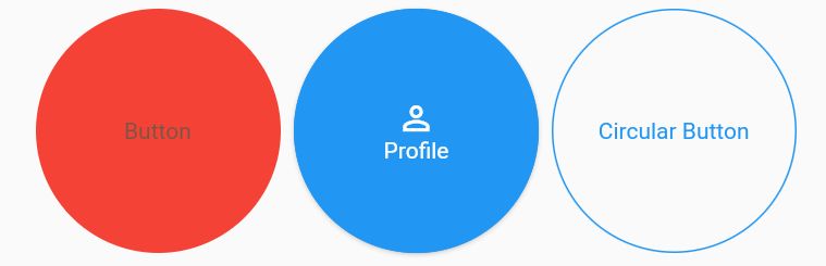
Circular buttons can be used to add extra visual flair to your app and can be helpful in drawing attention to specific elements. They can also be used to create a more uniform look and feel across your app.
You can often find it on a profile screen or any other screen where you need to show an important button.
CircleAvatar(
    backgroundColor: Colors.red,
    radius: 75,
    child: TextButton(
      child: const Center(child: Text('Button')),
      onPressed: () {},
    ),
  ),
SizedBox(
  width: 150,
  height: 150,
  child: MaterialButton(
    shape: const CircleBorder(side: BorderSide(width: 1, color: Colors.blue, style: BorderStyle.solid)),
    child: Column(
      mainAxisAlignment: MainAxisAlignment.center,
      children: const [
        Icon(Icons.perm_identity, color: Colors.white),
        Text("Profile"),
      ],
    ),
    color: Colors.blue,
    textColor: Colors.white,
    onPressed: () {
      print('clicked');
    },
  )),
SizedBox(
    width: 150,
    height: 150,
    child: TextButton(
        child: const Center(child: Text('Circular Button')),
        style: ButtonStyle(
            padding: MaterialStateProperty.all<EdgeInsets>(const EdgeInsets.all(16.0)),
            foregroundColor: MaterialStateProperty.all<Color>(Colors.blue),
            shape: MaterialStateProperty.all<RoundedRectangleBorder>(RoundedRectangleBorder(borderRadius: BorderRadius.circular(75.0), side: const BorderSide(color: Colors.blue)))),
        onPressed: () {}),
  ),