How to Create a Rounded Corners Button in CSS
Creating rounded corners for your buttons in CSS is a pretty simple process. All you need to do is create a few rules for your button class and you’re good to go!
Here’s a basic CSS rule for creating rounded corners: .button { border-radius: 4px; }. This will give your button 4px of roundedness on each corner. If you want to increase or decrease the amount of rounding, simply change the value accordingly.
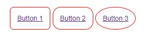
<div class="wrapper">
      <a href="#" class="btn btn-1">Button 1</a>
      <a href="#" class="btn btn-2">Button 2</a>
      <a href="#" class="btn btn-3">Button 3</a>
    </div>
.btn{
  border: 1px solid red;
  padding: 1em;
  font-size: 14px;
  cursor: pointer;
  border-radius: 4px;
}
.btn-1{
  border-radius: 8px;
}
.btn-2{
  border-radius: 16px;
}
.btn-3{
  border-radius: 50%;
}
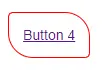
<a href="#" class="btn btn-4">Button 4</a>
<style text="text/css">
.btn-4{
  border-radius: 5px 25px;
  border: 1px solid red;
  padding: 1em;
  font-size: 14px;
  cursor: pointer;
}
</style>