How to Create a Modal Using CSS
A modal is an element on a web page that can be used to provide additional information or functionality to the user. It usually pops up in a new window or tab and can be customized using CSS.
When you create a popup modal using nothing but CSS, you have complete control over the look and feel of the modal. This can be helpful if you want to match the popup modal to the rest of your website’s design.
You can also use CSS to make the popup modal more user-friendly, such as by making it responsive so that it adapts to different screen sizes. There is no need to include third-party JavaScript or jQuery too.
In this snippet, we will create a modal using only CSS and HTML.
<div class="wrapper">
<a href="#modal" class="btn">Open Modal</a>
</div>
<div id="modal" class="modal">
<div class="content">
<a href="#" class="btn_close">×</a>
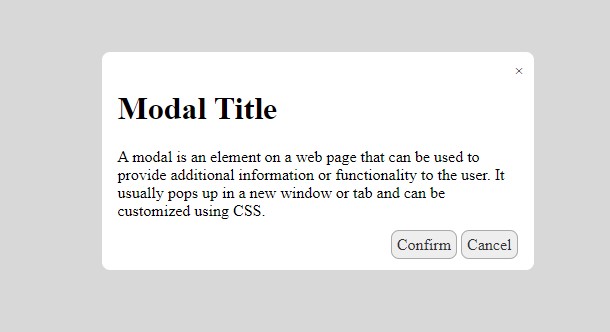
<h1>Modal Title</h1>
<p>
A modal is an element on a web page that can be used to provide additional information or functionality to the user. It usually pops up in a new window or tab and can be customized using CSS.
</p>
<div class="footer">
<a href="#" class="btn">Confirm</a> <a href="#" class="btn btn-cancel">Cancel</a>
</div>
</div>
</div>
<style type="text/css">
.wrapper {
height: 100vh;
display: flex;
align-items: center;
justify-content: center;
}
a.btn, a.btn:visited{
background-color: #EEE;
border: 1px solid #AAA;
border-radius: 8px;
padding: 5px;
text-decoration: none;
color: #333;
}
.modal {
visibility: hidden;
opacity: 0;
position: absolute;
top: 0;
right: 0;
bottom: 0;
left: 0;
display: flex;
align-items: center;
justify-content: center;
background: rgba(200, 200, 200, .7);
transition: all .4s;
}
.modal:target {
visibility: visible;
opacity: 1;
}
.modal .content {
position: relative;
width: 400px;
max-width: 90%;
background: #fff;
padding: 1em;
border-radius: 8px;
}
.modal .footer {
text-align: right;
}
.modal .btn_close {
position: absolute;
top: 10px;
right: 10px;
color: #585858;
text-decoration: none;
}
</style>
The :target pseudo-class is a CSS selector that allows you to select the element that is currently being targeted by the browser. This can be useful for creating modals and other types of UI elements that need to be triggered by an event.
One advantage of using the :target pseudo-class is that it requires zero JavaScript, which can be a performance bottleneck on some devices. The :target pseudo-class can also be used to create animations and transitions that are triggered by an event. When used with care, the :target pseudo-class can be a powerful tool for creating sophisticated UI elements with minimal code.