How to Change Size of Images in CSS
Images are an important part of any web page, and often you’ll need to control their size of them. You can do this in many ways, but most commonly you’ll use CSS.
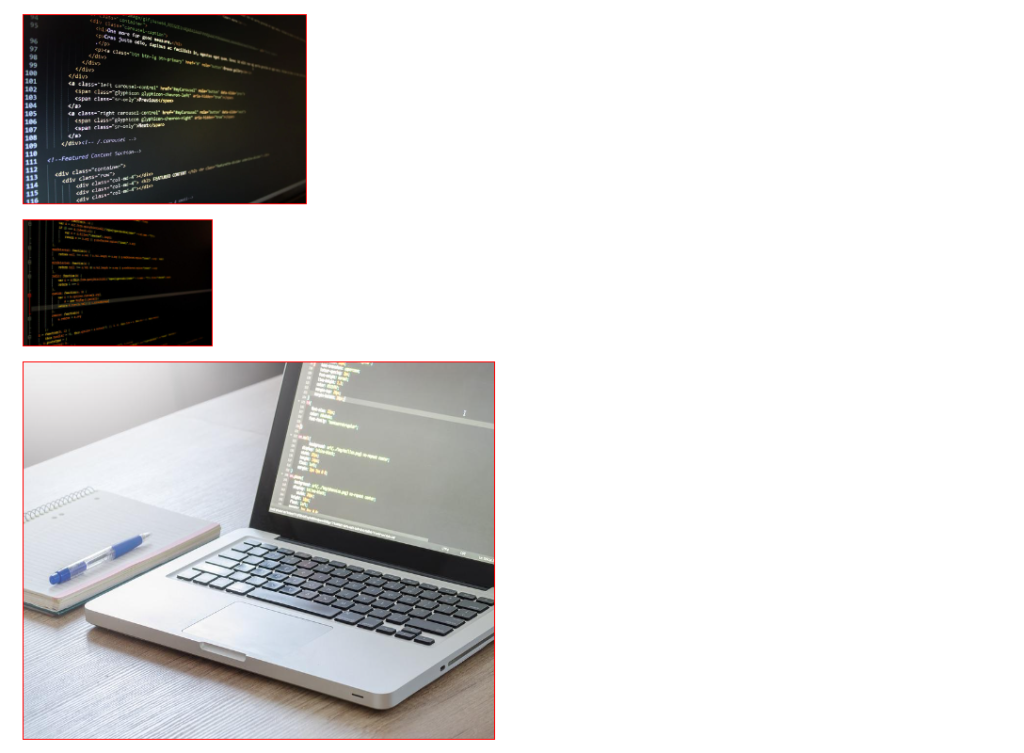
CSS has two properties you can use to control the size of images: width and height. The width property sets the width of the image in pixels, while the height property sets the height of the image in pixels. You can use either property or both, to control the size of your images.
<html>
  <head>
    <style text="text/css">
      .wrapper{margin: 2em; font-family: sans-serif;}
      .img-wrapper{
        margin-bottom: 1em;
      }
      .img-wrapper img{
        border: 1px solid red;
      }
      #img1{width: 300px;}
      #img1 img{width: 100%;}
      #img2{width: 500px;}
      #img2 img{width: 200px;}
      #img3{width: 500px;}
      #img3 img{height: 400px; max-width: 500px;}
    </style>
  </head>

  <body>
    <div class="wrapper">
      <div class="img-wrapper" id="img1">
        <img src="https://cdn.pixabay.com/photo/2015/02/24/02/05/website-647013_960_720.jpg" />
      </div>
      <div class="img-wrapper" id="img2">
        <img src="https://cdn.pixabay.com/photo/2015/09/09/21/12/monitor-933392_960_720.jpg" />
      </div>
      <div class="img-wrapper" id="img3">
        <img src="https://cdn.pixabay.com/photo/2017/09/05/10/19/business-2717063_960_720.jpg" />
      </div>
    </div>
  </body>
</html>
Remember, you can always use multiple rules to target specific images if you need to. For example, if you only want to resize certain images on your page, you could add a class or ID to those images and then create a rule specifically for them. This gives you a lot of flexibility in how you control the size of your images.