Create Ribbon Effect with Transform Property in CSS
In this snippet, we will learn how to create a ribbon effect with transform property in CSS3.
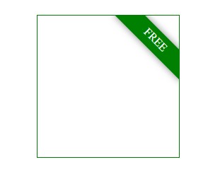
Ribbons are widely used in web design these days. They are used to add decorative elements to websites and enhance the overall look and feel of the site. Ribbons can be created using different HTML5 and CSS3 properties.
In this tutorial, we will use the transform property to create a ribbon effect. Transform property is used to scale, rotate, skew and translate elements. It is widely supported by all modern browsers.
<div class="outer">
    <div class="ribbon">FREE</div>
</div>

<style type="text/css">
.outer{
    position: relative;
    overflow: hidden;
    width: 200px;
    height: 200px;
    border: 1px solid green;
}

.outer .ribbon{
    position: absolute;
    right: -33px;
    background: green;
    width: 134px;
    height: 25px;
    transform: rotate(45deg);
    -webkit-box-shadow: 0 0 10px #888;
    -moz-box-shadow: 0 0 10px #888;
    box-shadow: 0 0 10px #888;
    color: white;
    text-align: center;
    padding: 5px 0 0 0;
    top: 20px;
    overflow: hidden;
    white-space: nowrap;
}
</style>