Create Frosted Glass Effect in CSS
Glassmorphism is a design style that incorporates semi-transparent shapes and smooth transitions to create a layered, glass-like effect. This approach has become increasingly popular in recent years, as it lends itself well to modern, minimalist designs.
The frosted glass effect is a popular design element that can be used to add a touch of style and sophistication to any web page with glassmorphism design. A way to achieve this effect is by using the CSS3 property, filter blur and box-shadow. This can be used to make an element appear more or less translucent.
One of the advantages of using these CSS3 properties is that it is supported by all major browsers. This means that you will not have to worry about your design not looking right in older browsers. Another advantage of using the properties is that it is very easy to change the degree of transparency by simply changing their values.
So we will use pure CSS3 to create a frosted glass effect in this snippet.
<div id="wrapper">
<div class="box">
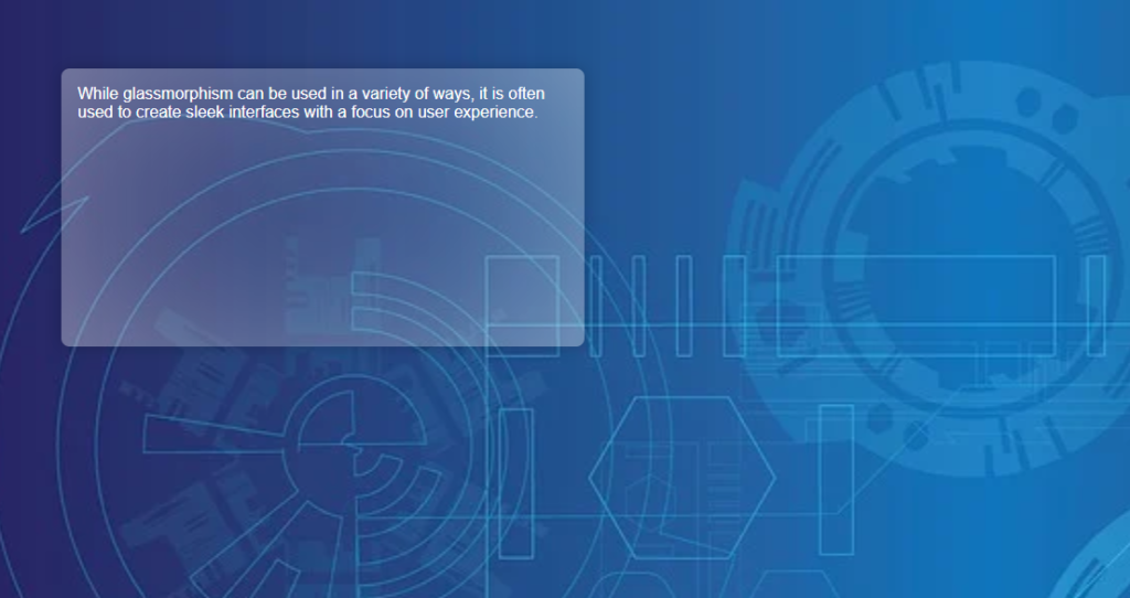
While glassmorphism can be used in a variety of ways, it is often used to create sleek interfaces with a focus on user experience.
</div>
</div>
<style type="text/css">
body{
padding: 5em;
font-family: sans-serif;
background:url("https://cdn.pixabay.com/photo/2016/10/11/21/43/geometric-1732847_960_720.jpg") 0 / cover;
}
.box {
width: 30rem;
height: 15rem;
box-shadow: 0 0 1rem 0 rgba(0, 0, 0, .2);
border-radius: 8px;
position: relative;
background: inherit;
overflow: hidden;
padding: 1em;
color: white;
}
.box::before {
content: "";
position: absolute;
background: inherit;
z-index: -1;
top: 0;
left: 0;
right: 0;
bottom: 0;
box-shadow: inset 0 0 2000px rgba(255, 255, 255, .5);
filter: blur(10px);
margin: -20px;
}
</style>