10 Best Flutter Animation Libraries in 2023
The Flutter framework offers a powerful and flexible built-in animation function. It provides easy-to-use APIs to create animations, whether you want to animate a simple color change or the most complex 3D scene.
The API makes it possible to use any of the following animation types: Color, Texture, Opacity, Position, Scale, Position, Orientation, and Rotation.
However, sometimes it is hard to make a complicated animation. Library developers have stepped up to the challenge, and there are now a number of Flutter animation libraries available.
In this article, we will look at 9 of the best Flutter animation libraries.
Best Flutter Animation Libraries
Flutter animation libraries are a must-have for any programmer looking to add life and personality to their applications. These libraries make it easy to create custom animations that will delight your users and set your application apart from the competition. With so many options available, you’re sure to find an animation library that meets your needs.
flutter_animate
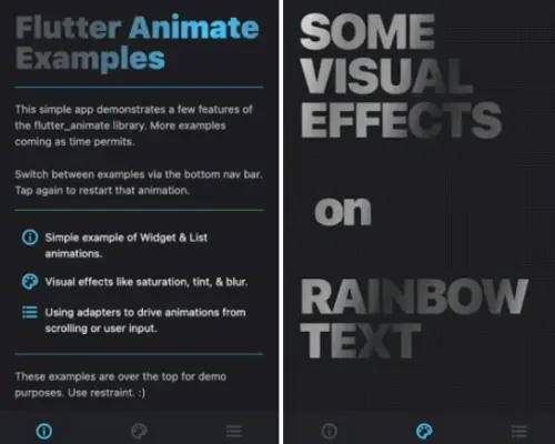
flutter_animate is a new library that makes it easy to add animated effects to any of Flutter’s widgets. With just a few lines of code, you can add animations that look great and run smoothly on any device.
You can use the Animate widget to add animations directly to your widget tree. Alternatively, you can use the .animate() extension method on any widget to wrap it in an Animate widget.
Animate(
  effects: [FadeEffect(), ScaleEffect()],
  child: Text("Flutter Animate"),
)
Text("Hello").animate()
  .fadeIn(delay: 300.ms, duration: 500.ms)
  .then() // sets own delay to 800ms (300+500)
  .slide(duration: 400.ms) // inherits the 800ms delay
  .then(delay: 200.ms) // sets delay to 1400ms (800+400+200)
  .blur() // inherits the 1400ms delay
  // Explicitly setting delay overrides the inherited value.
  // This move effect will run BEFORE the initial fade:
  .move(delay: 0.ms)
The library includes pre-built effects for fade, scale, slide, blur, shake, shimmer, and color effects, as well as easy custom effects and simplified animated builders. You can also synchronize animations to scroll, notifiers, or anything else.
All of this is available via a simple, unified API without needing to use AnimationController or StatefulWidget.
simple_animations
With Simple Animations, you can easily create custom, beautiful animations in no time. This library is well documented and enterprise-ready, making it a great choice for your next project. Highlights include the ability to animate multiple properties at once and stagger animations for a quick and easy workflow. You’ll also find debugging animations a breeze with this powerful library.
import 'package:flutter/material.dart';
import 'package:simple_animations/simple_animations.dart';

// Simple staggered tween
final tween1 = MovieTween()
  ..tween('width', Tween(begin: 0.0, end: 100),
          duration: const Duration(milliseconds: 1500), curve: Curves.easeIn)
      .thenTween('width', Tween(begin: 100, end: 200),
          duration: const Duration(milliseconds: 750), curve: Curves.easeOut);

// Design tween by composing scenes
final tween2 = MovieTween()
  ..scene(
          begin: const Duration(milliseconds: 0),
          duration: const Duration(milliseconds: 500))
      .tween('width', Tween<double>(begin: 0.0, end: 400.0))
      .tween('height', Tween<double>(begin: 500.0, end: 200.0))
      .tween('color', ColorTween(begin: Colors.red, end: Colors.blue))
  ..scene(
          begin: const Duration(milliseconds: 700),
          end: const Duration(milliseconds: 1200))
      .tween('width', Tween<double>(begin: 400.0, end: 500.0));

// Type-safe alternative
final width = MovieTweenProperty<double>();
final color = MovieTweenProperty<Color?>();

final tween3 = MovieTween()
  ..tween<double>(width, Tween(begin: 0.0, end: 100))
  ..tween<Color?>(color, ColorTween(begin: Colors.red, end: Colors.blue));
animations
This bundle provides pre-programmed animations for commonly requested effects. The movements may be modified to fit your material and inserted into your application to amuse your customers.
This package defines the following transition patterns: Container transform, Shared axis, Fade through, and Fade.
void main() {
  runApp(
    MaterialApp(
      theme: ThemeData.from(
        colorScheme: const ColorScheme.light(),
      ).copyWith(
        pageTransitionsTheme: const PageTransitionsTheme(
          builders: <TargetPlatform, PageTransitionsBuilder>{
            TargetPlatform.android: ZoomPageTransitionsBuilder(),
          },
        ),
      ),
      home: _TransitionsHomePage(),
    ),
  );
}
shimmer_animation
Shimmer, a skeleton loader widget can help you create beautiful animations and loading screens without any additional coding. It’s designed to be modular which allows developers to easily build their own loaders in code.
Shimmer(
    duration: Duration(seconds: 3), //Default value
    interval: Duration(seconds: 5), //Default value: Duration(seconds: 0)
    color: Colors.white, //Default value
    colorOpacity: 0, //Default value
    enabled: true, //Default value
    direction: ShimmerDirection.fromLTRB(),  //Default Value
    child: Container(
      color: Colors.deepPurple,
    ),
  ),
flutter_sequence_animation
Flutter Sequence Animation is a robust and simple-to-use package. No need to calculate percentages or place animations on intervals with this tool.
Animate the same variable with multiple animatables, and this sequence animation will automatically switch among all of them according to your desired time intervals!
An intuitive and easy interface ensures you’ll be able to animate anything quickly and easily every time.
sequenceAnimation = new SequenceAnimationBuilder()
      .addAnimatable(
          animatable: new ColorTween(begin: Colors.red, end: Colors.yellow),
          from:  const Duration(seconds: 0),
          to: const Duration(seconds: 2),
          tag: "color"
        ).addAnimatable(
          animatable: new ColorTween(begin: Colors.yellow, end: Colors.blueAccent),
          from:  const Duration(seconds: 2),
          to: const Duration(seconds: 4),
          tag: "color",
          curve: Curves.easeOut
        ).addAnimatable(
          animatable: new ColorTween(begin: Colors.blueAccent, end: Colors.pink),
          //  animatable: new Tween<double>(begin: 200.0, end: 40.0),
          from:  const Duration(seconds: 5),
          to: const Duration(seconds: 6),
          tag: "color",
          curve: Curves.fastOutSlowIn
        ).animate(controller);
bouncing_widget
Give your app a bounce with flutter_bouncing_widget! This widget makes animation easy and accessible while keeping it lightweight and without any external dependencies.
Flutter Bouncing Widget enables you to add an attractive bouncy animation on any widget, making it seem lively and interactive to users like never before!
BouncingWidget(
  duration: Duration(milliseconds: 100),
  scaleFactor: 1.5,
  onPressed: () {
    print("onPressed");
  },
  child: Text(
    "Hello !",
    style: TextStyle(
      color: Colors.white,
      fontWeight: FontWeight.bold,
      fontSize: 35,
    ),
  ),
),
auto_animated
This library offers an easy way to animate your widgets with standard animations. You’ll be able to customize your animations to match your app’s look and feel precise.
Widget’s auto-play animation begins when it is mounted. Animations are a great way to add extra polish and visual interest to your app, and with this library, they’re easy to create.
// With predefined options
LiveList.options(
  options: options,

  // Like ListView.builder, but also includes animation property
  itemBuilder: buildAnimatedItem,

  // Other properties correspond to the
  // `ListView.builder` / `ListView.separated` widget
  scrollDirection: Axis.horizontal,
  itemCount: 10,
);

// Or raw
LiveList(
  delay: /*...*/,
  showItemInterval: /*...*/,
  // ... and all other arguments from `LiveOptions` (see above)
);
delayed_display
Delayed_display is a widget for displaying layers after a delay. You can also use it to create beautiful animations as you introduce new content to the user by combining fading, sliding, and bounce animation.
It even handles links that ensure that your content doesn’t change when somebody hovers over them while they are being delayed but will trigger once clicked on.
DelayedDisplay(
  delay: Duration(seconds: 1),
  child: Text(
    "Hello",
    style: TextStyle(
      fontWeight: FontWeight.bold,
      fontSize: 35.0,
      color: Colors.white,
    ),
  ),
),
circular_reveal_animation
This package allows a widget to be revealed by a circular mask.
CircularRevealAnimation(
  // @required
  child: Container(color: Colors.red),
  // @required [Animation<double>]
  animation: animation,
  // child's center if not specified
  centerAlignment: Alignment.centerRight,
  // 0 if not specified
  minRadius: 12,
  // distance from center to further child's corner if not specified
  maxRadius: 200,
);
flip_card
A flip-card effect is available as a component. It may be used to conceal and reveal product information.
FlipCard(
  fill: Fill.fillBack,
  direction: FlipDirection.HORIZONTAL,
  front: Container(
        child: Text('Front'),
    ),
    back: Container(
        child: Text('Back'),
    ),
);